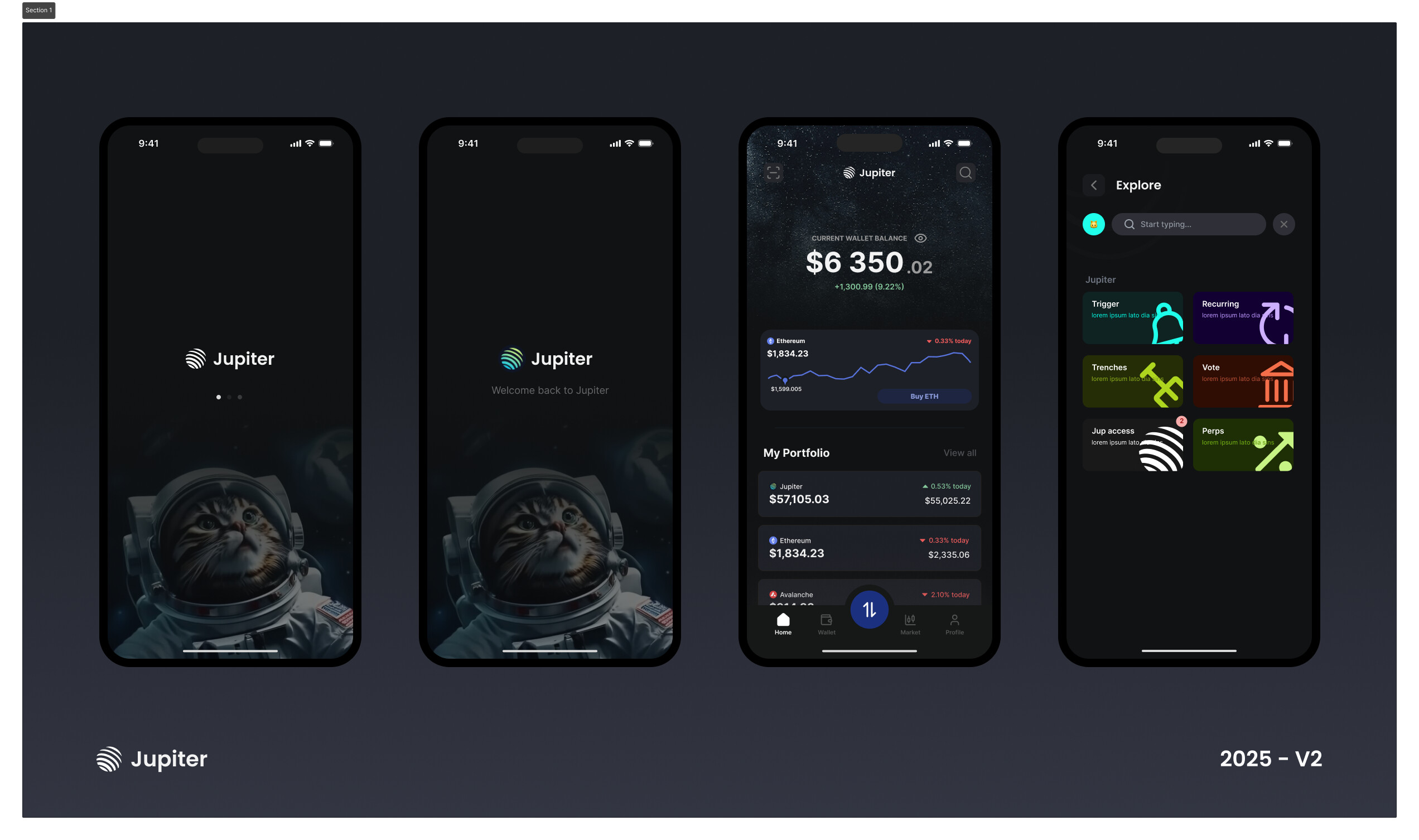
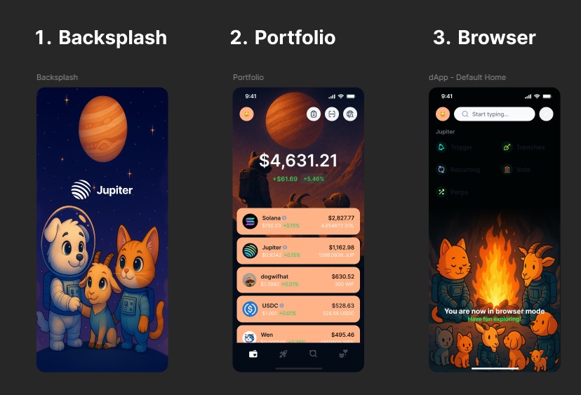
After deep exploration and iteration, I’m submitting the updated visual system for the core three screens of the Jupiter app — Splash, Portfolio, and Browser. These aren’t just screens. They form a connected, cinematic experience rooted in emotion, narrative, and neuro-branding. Below is the rationale behind each, based on the principle of exponential creative improvement — not incremental tweaks.
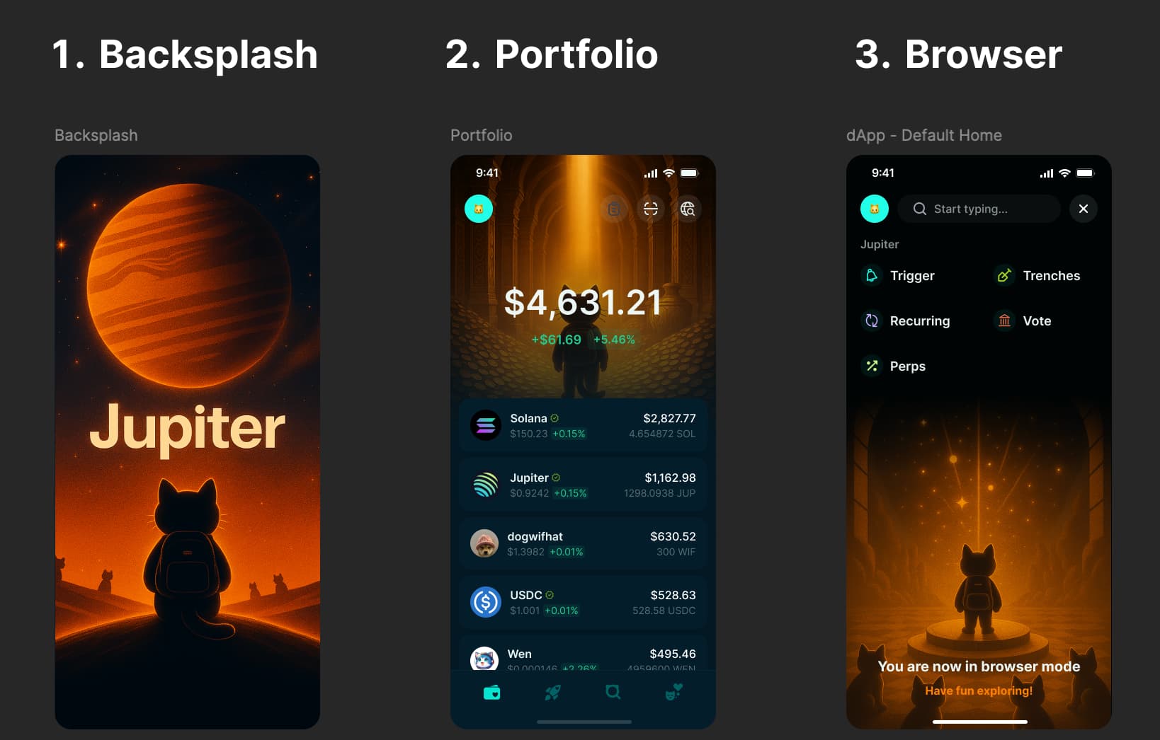
1. Splash Screen
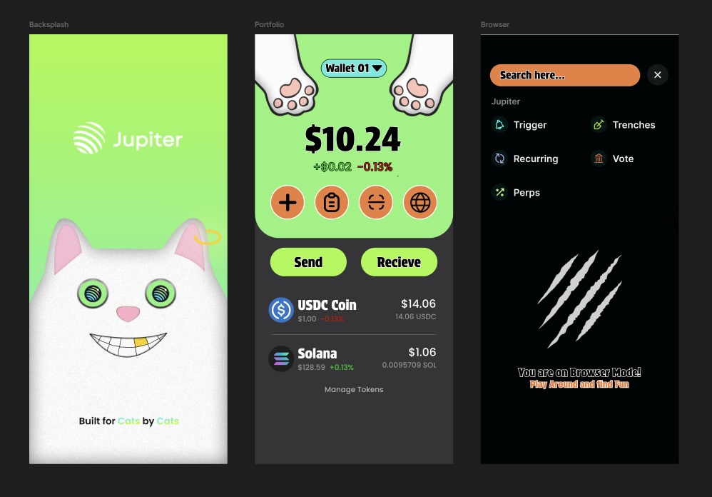
I reimagined the splash screen with a clear objective: create an emotional bridge into the product. The lone cat with a backpack, looking up at the glowing planet Jupiter, sets the tone immediately. It sparks curiosity and a sense of quiet purpose. It’s not just visual — it’s directional. The user is about to start their DeFi journey, and this screen makes that feel meaningful.
I deliberately replaced the Jupiter logo with the actual planet. This wasn’t just aesthetic — it was strategic. Over time, the planet itself becomes the brand asset. Something you can own and anchor memories to.
The color treatment — warm orange gradients against a deep cosmic navy — was chosen to balance emotional warmth with credibility. Compared to the original green/blue splash, this one carries a stronger sense of narrative and intent. It doesn’t just say “crypto app,” it says “adventure begins here.”
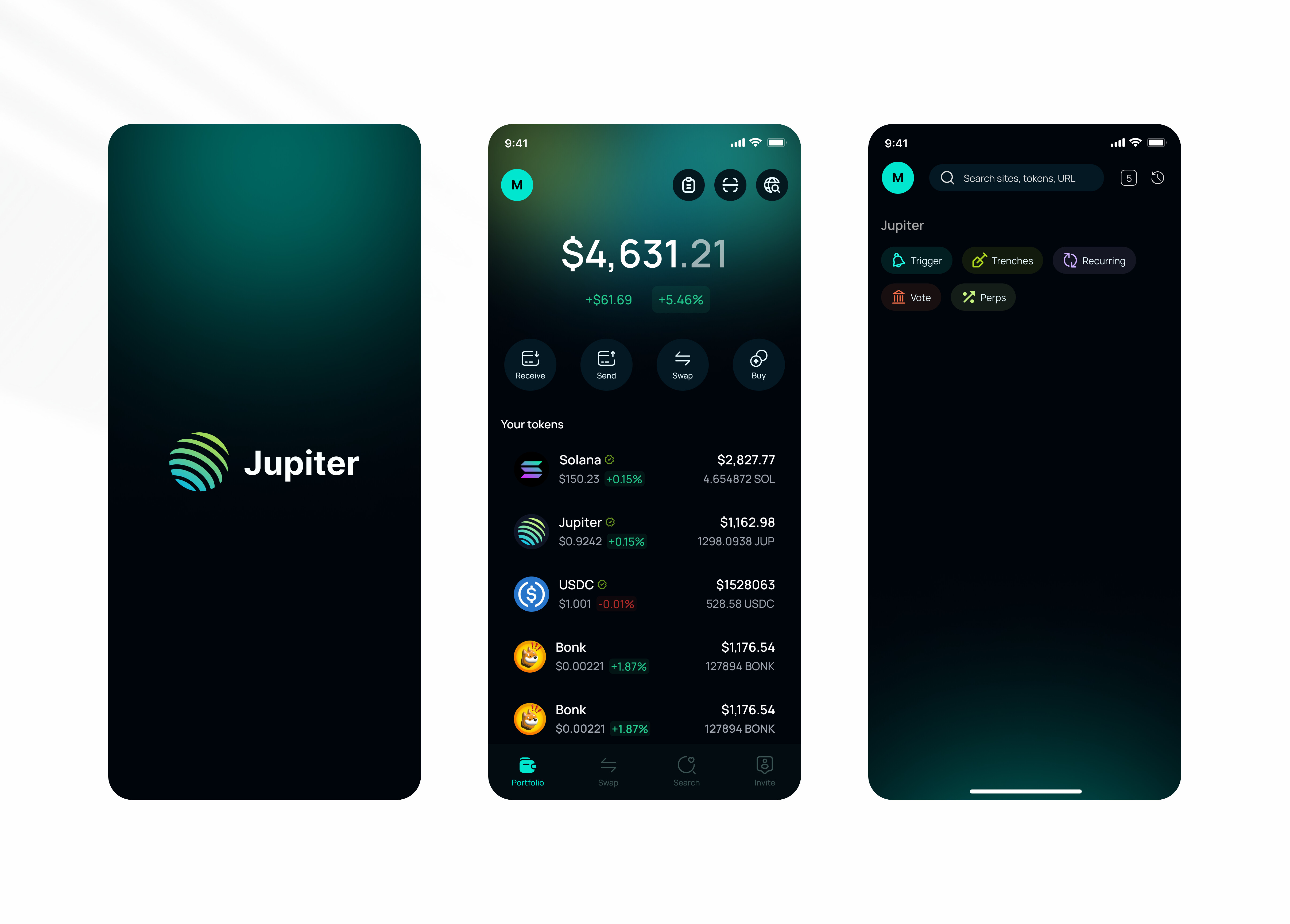
2. Portfolio Screen
This one was all about aligning emotion to functionality. I designed a visual metaphor for value: a cat entering a golden vault, bathed in light. It’s cinematic, it’s slightly reverent — because people’s money should feel important. Sacred, even.
The spotlight down the center is intentional — it frames the portfolio value and literally pulls your eye toward it. That’s your dopamine hit right there. No fluff. No distraction. Just pure reward psychology.
Versus the older version, which felt flatter and purely utilitarian, this new design drives more engagement by tapping directly into visual and emotional memory. It’s not just a balance. It’s your treasure room.
3. Browser Screen
This was the hardest one, because I needed to show utility and community without adding noise.
I landed on the idea of a ceremonial platform — one cat standing at the center of a radiant constellation, while others watch. It’s a signal. This is where you discover the world of Jupiter. It’s elevated. Shared. Bigger than just you.
Every detail — from the glow to the symmetry — was crafted to guide the eye upward, in line with the natural scroll direction. The constellation acts as a metaphor for exploration. The observing cats lock in the feeling of tribe. It says: “Welcome, you’re one of us now.”
Compared to the original campfire scene — which I still think had charm — this version triggers something deeper: awe, scale, possibility.
Final Frame: Why I Did This
My goal wasn’t just to make the app prettier. I wanted to encode emotional memory into the core screens of the product.
The original UI had clarity, but it lacked feeling. These designs turn every screen into a chapter of the same story:
- You arrive, curious and full of wonder.
- You see what you own, and it feels valuable.
- You explore, not alone, but as part of something greater.
In branding terms, this is the hero’s journey — not abstract, but embedded in the scroll itself. I designed this to make people feel proud to open the app.
Link to Figma file https://www.figma.com/design/BtgGoSdrm2s54a8Z8Aaj9w/Jupiter-Mobile-V2-Design-Contest---Submission-Browski?node-id=0-1&t=TN4d7SCDSNkFQ8p7-1