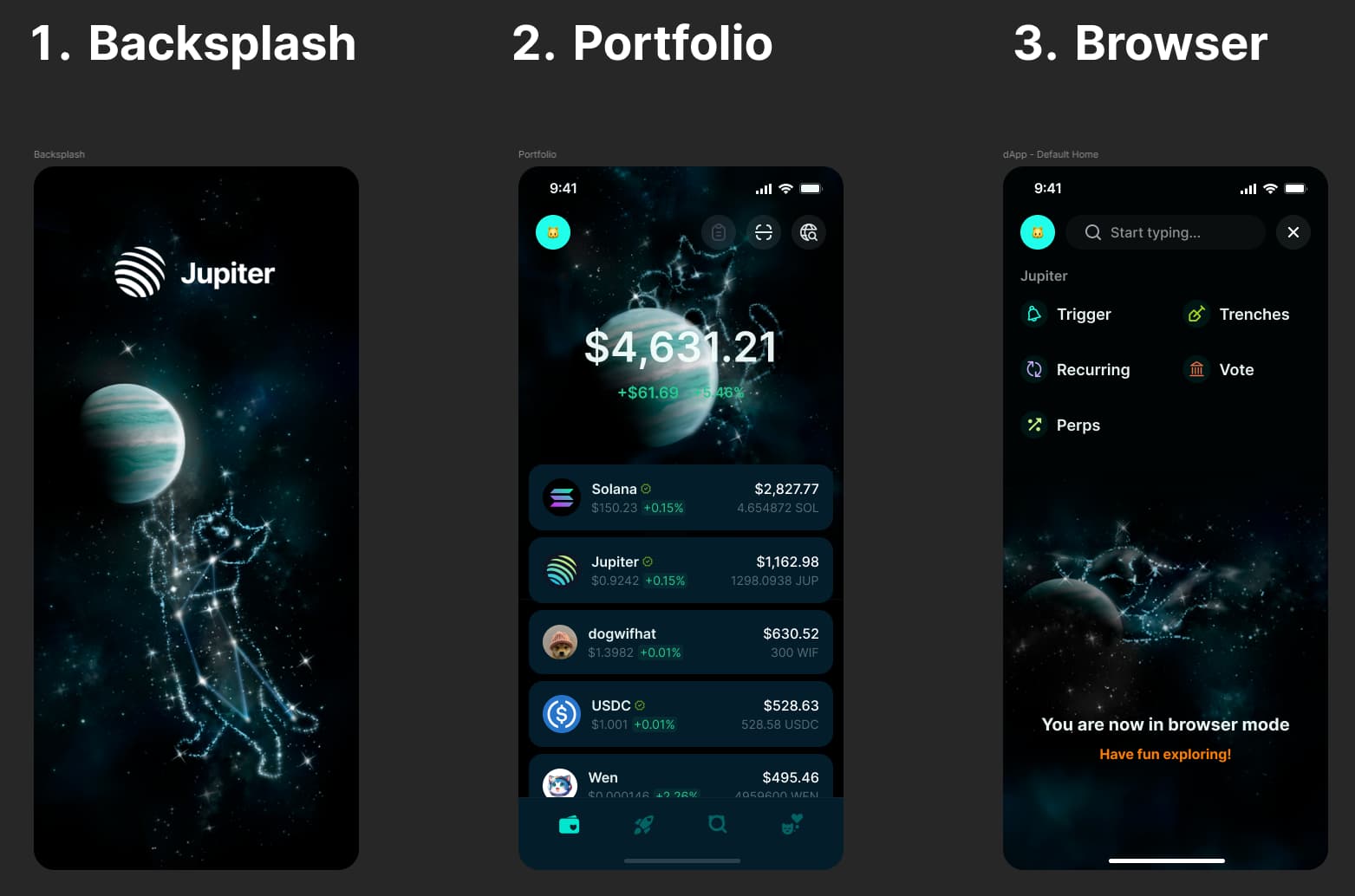
I hope you enjoy my art! It was not created by AI, and I aimed to contrast elements of fantasy, technology, and astronomy, bringing a playful and mystical vision of space. The cats, iconic figures of curiosity and mystery, are formed by stars, symbolizing exploration and the connection between the real and digital worlds. As if they were playing, they interact with Jupiter, which becomes their ball of yarn—representing the crypto and financial universe in an accessible, fun, and engaging way.
3 Likes
Hello, how’s the contest going, i can see a lot of people are competing already.
1 Like
Oooh
Didn’t notice that…
1 Like
how could you not notice that you stole my design? lol
2 Likes
The Speed of Adventure
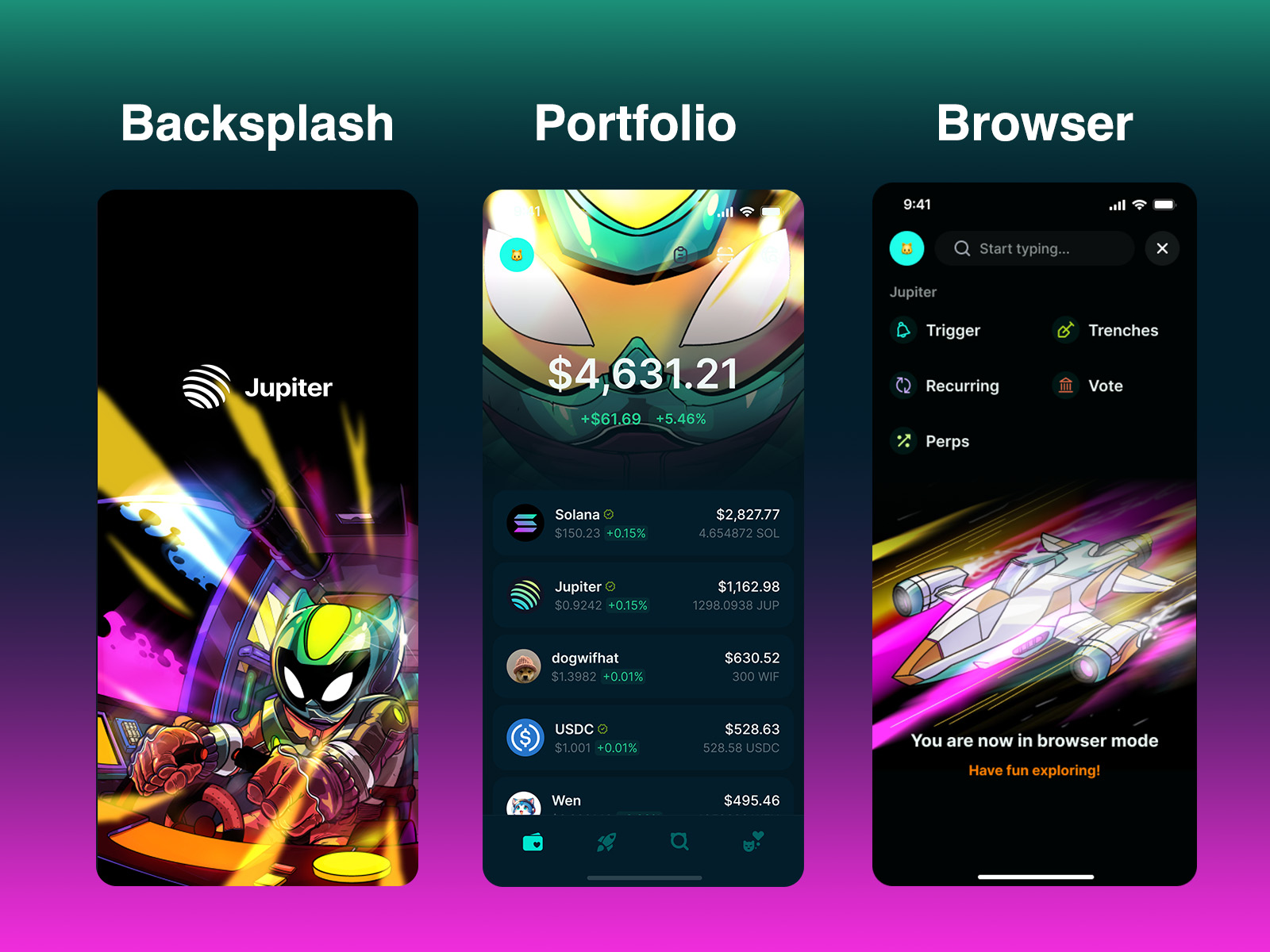
My design concept looks to visualize the elements of Jupiter’s products and brand that I most enjoy:
- Speed
- Dynamism
- Adventure
- Curiosity
Starting with the loading screen, I want to grab the attention of the user with a vibrant dynamic scene. Our cat explorer is speeding into some new adventure, reflecting the user’s journey. The portfolio page brings the user up close to our Explorer, almost as if looking in a mirror. As they get to the Browser tab, we pull back to see our protagonist’s speeding ship: off they go to explore the Jupiverse and beyond…all at the speed of adventure!
2 Likes
My entry for Jupiter Mobile v2
Every single elements used comes from a deep research and understanding what works best
Made with Canva (my smartphone)
1 Like
stolen art again. Including mine and others. Its a design contest, not steal from other with no credit.
2 Likes
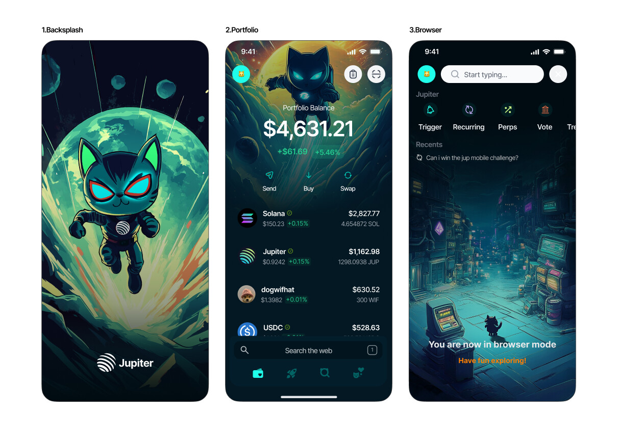
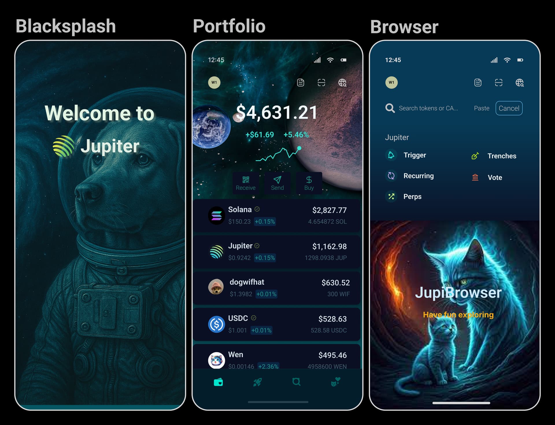
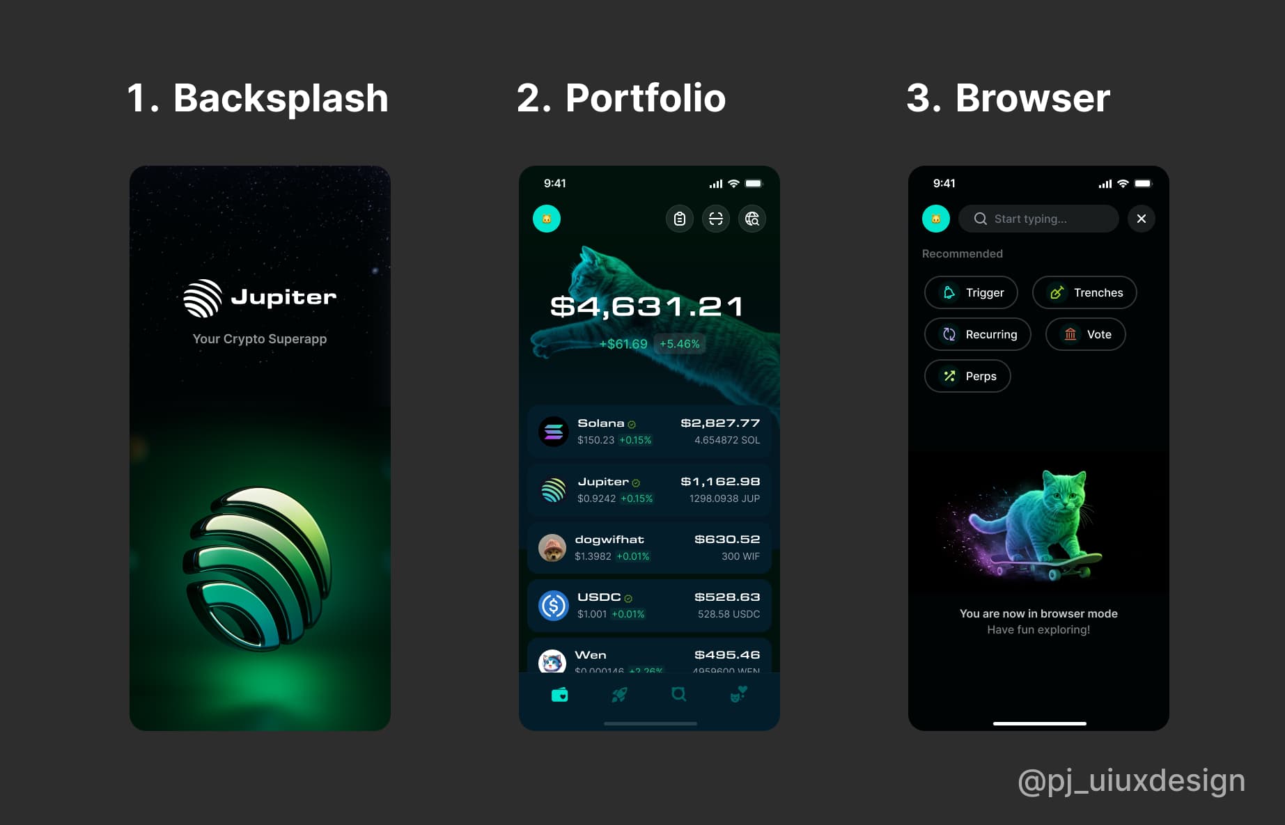
Jupiter Mobile V2 Design Contest Submission
As a user of the Jupiter mobile wallet and a product designer i got on the Jupiter mobile contest ![]()
Key features📌of my entry
1.Redesigned backsplash art✅.
2.Redesigned portfolio page with key metric fixes and enhanced user experience including easy access to browser, easy access to sending and receiving assets, Improved artwork✅.
3.Redesigned browser page and artwork showcasing recent visits as well as main visits on the Jupiter ecosystem✅.
I ensured my redesign followed good design principles for proper usability
Find my entry link below🔗 - https://www.figma.com/design/Q0ilmOK4xSgoKN03lpRp8D/Jupiter-Design-Challenge--Copy-?node-id=0-1&t=2gmMWepNEBUxYCFs-1
3 Likes
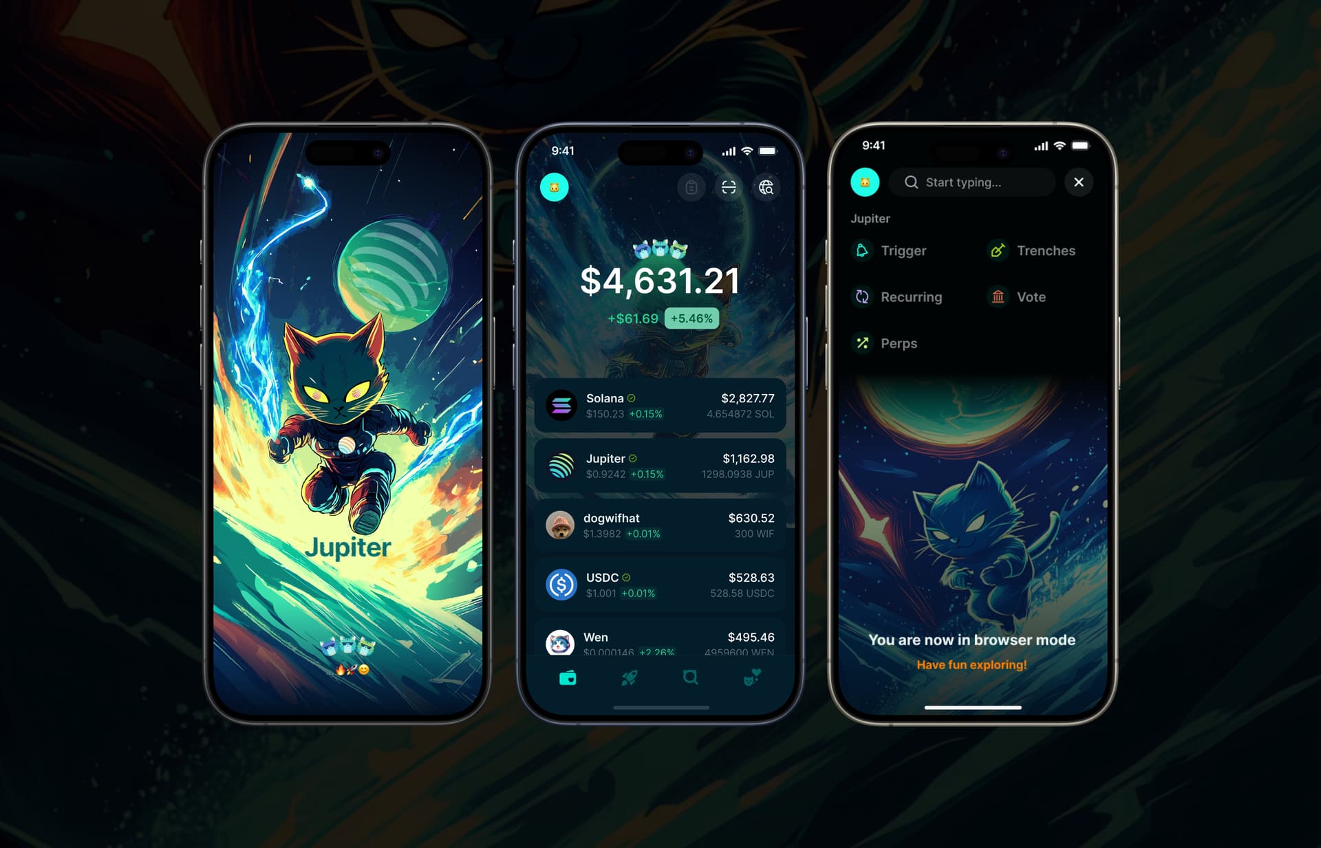
I’m thrilled to share my Jupiter app redesign for the design contest.
surfing energy waves on the splash screen, celebrating
with crowns on the portfolio page, and relaxing in browser mode.
The backsplash
Upgraded Jupiter’s welcome screen with an action hero cat surfing on electric waves! Dynamic pose and vibrant colors transform crypto into an adventure.
The portfolio
Portfolio screen reimagined with crown elements celebrating crypto success and enhanced cosmic backdrop. Same functionality, more personality.
The Browser
Browser mode gets its own vibe! A relaxed, sleeping cat sets the tone for exploration, balancing the high-energy splash screen. Your mascot now guides the journey.
1 Like
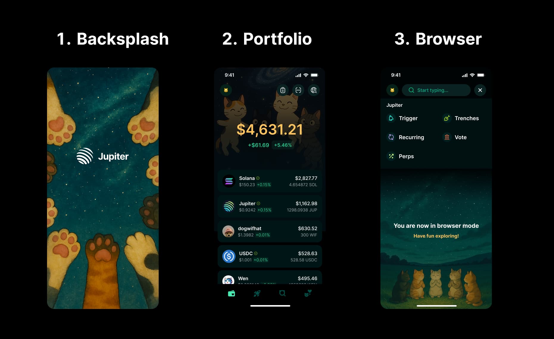
Heyy, here’s my entry for the @jup_mobile Background Contest! ![]()
![]() So pumped to share these!
So pumped to share these!
![]() Backsplash - Cosmic Paw Reach
Backsplash - Cosmic Paw Reach ![]()
My space cat’s reaching for a tiny, glowing Jupiter with colorful rings. I made it small for fun vibes—perfect for a magical dark mode start on Jupiter Mobile!
![]() Portfolio - Starry-Eyed Trader
Portfolio - Starry-Eyed Trader ![]()
Inspired by a Sonic the Hedgehog scene I love, where Shadow’s eyes sparkle with stars, my space cat’s got that same galaxy glow. It’s the vibe for checking memecoins on Jupiter Mobile with a spark of wonder!
![]() Browser - Lunar Chill Explorer
Browser - Lunar Chill Explorer ![]()
My astronaut cat’s chilling on the moon by a crater, lantern glowing, browsing dapps on Jupiter Mobile. A cozy, relaxed vibe for exploring the Jupiverse!
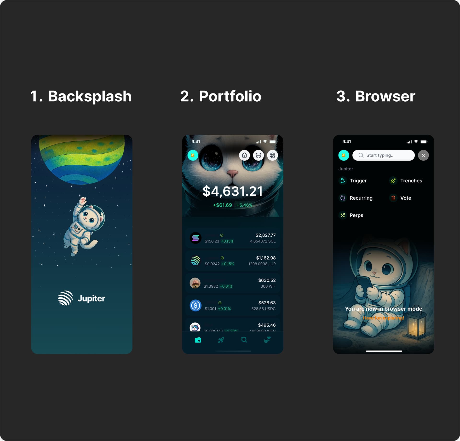
link to my figma file: https://www.figma.com/design/vK7mC0UEMwLY8ApKlL4kRT/Untitled?node-id=0-1&t=6XM4KirgzHyCPRkQ-1
1 Like
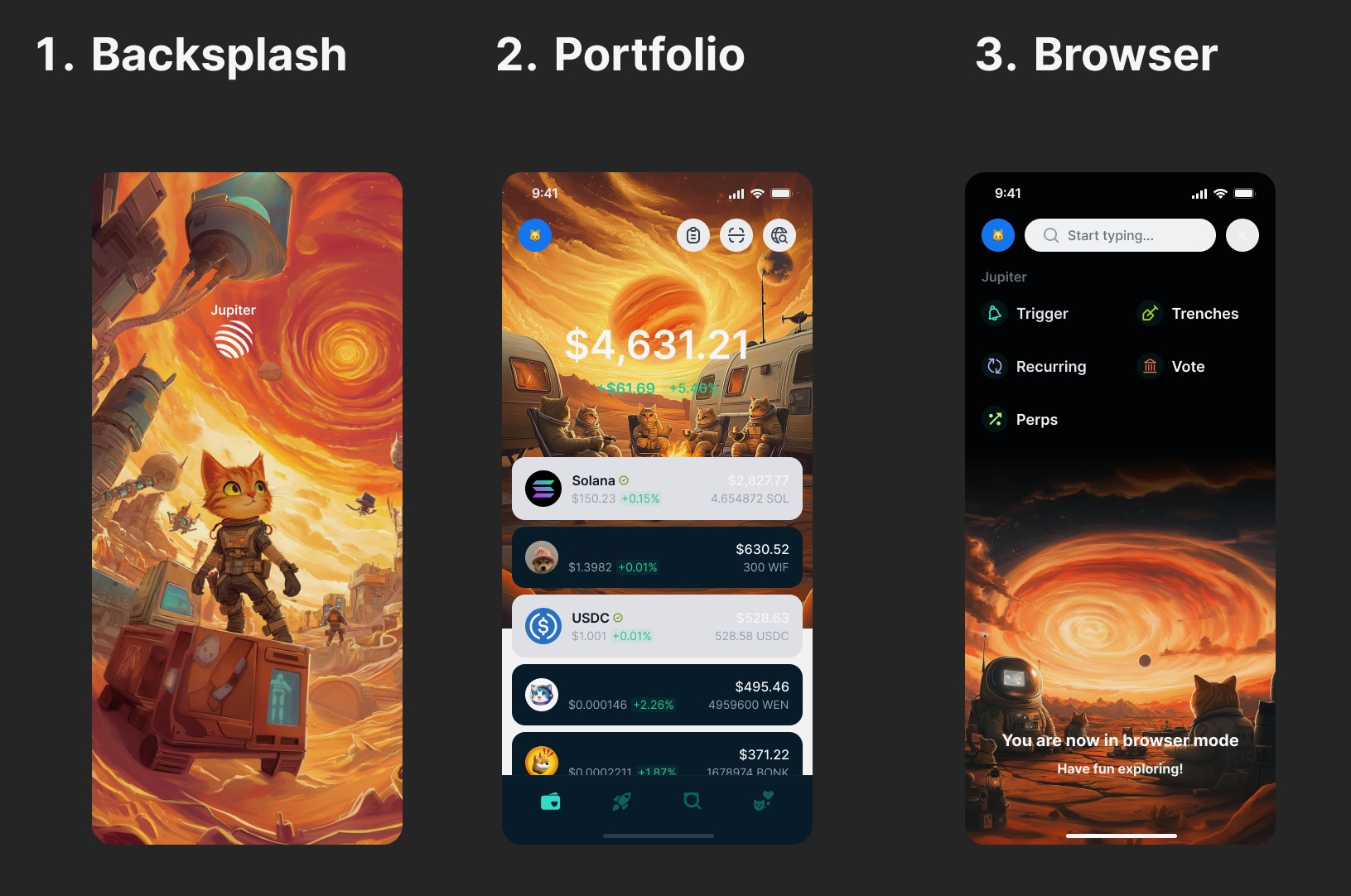
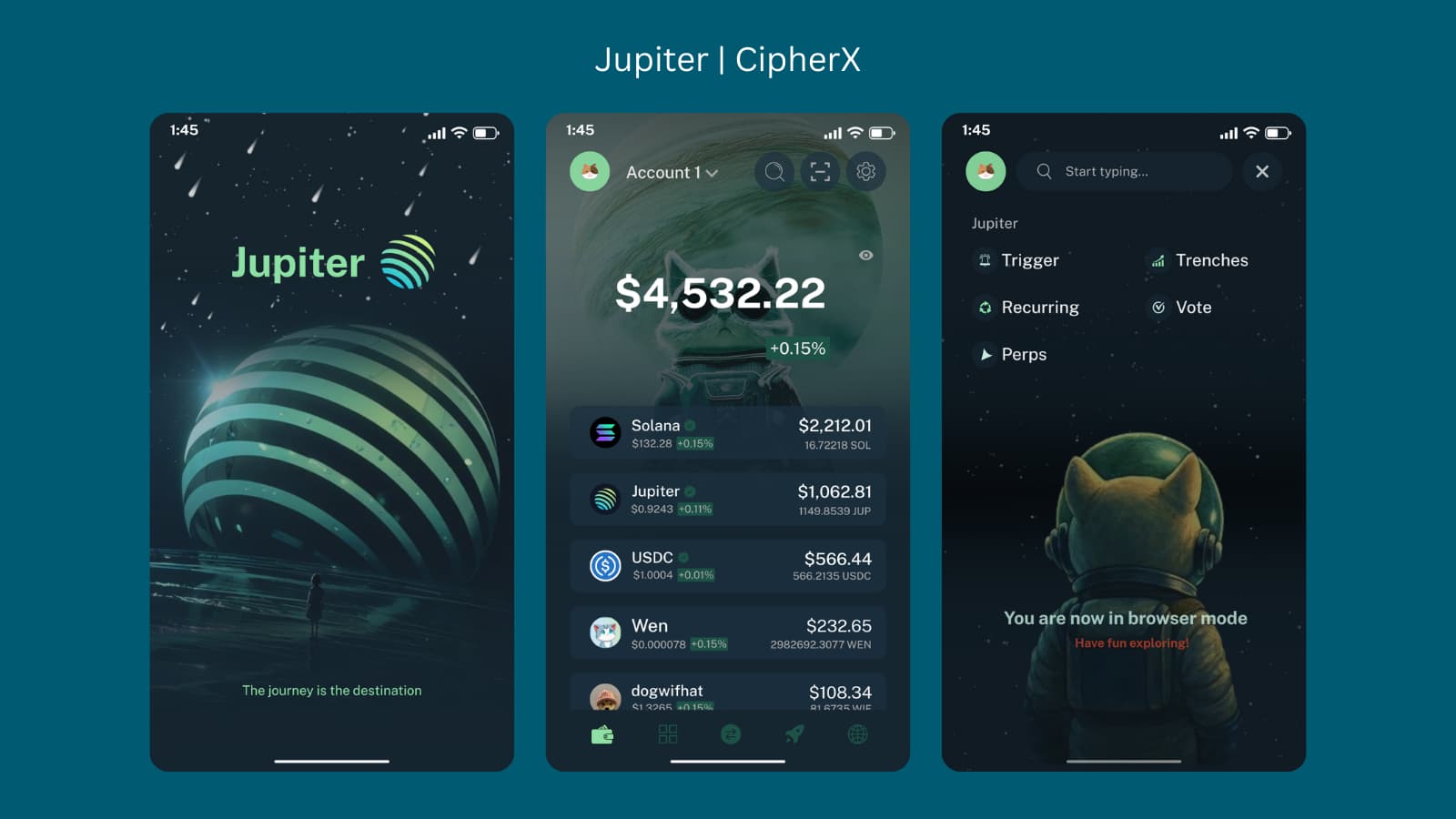
Last year, it was all about venturing into the vast, desolate unknown. This year, we’re building. The dust has settled, and the first settlers—spacefaring cats—are laying the foundations of a new life.
![]() A pioneer stands tall, surveying the red-hot terrain as the first structures rise behind them. The Great Red Spot watches over this new beginning.
A pioneer stands tall, surveying the red-hot terrain as the first structures rise behind them. The Great Red Spot watches over this new beginning.
![]() A moment of reflection—astronaut cats lounge under the alien night sky, taking in the magnitude of their journey so far.
A moment of reflection—astronaut cats lounge under the alien night sky, taking in the magnitude of their journey so far.
![]() Fireside camaraderie in a new world. Settlers gather around the flames, forging bonds and shaping the future.
Fireside camaraderie in a new world. Settlers gather around the flames, forging bonds and shaping the future.
The journey doesn’t end with exploration—it begins with building. #Jupiter #NewFrontier #SciFiArt
2 Likes
You did a great job, keep it up
1 Like
nice contest, looking forward to it
1 Like
Wow I definitely will go for this
1 Like
Here’s my entry for @jup_mobile.
Took an anime inspired approach making it more intuitive, welcoming, and fun.
2 Likes
Nice design man🤞🏼 good luck
1 Like
Jupiter Visual System v2: A Second Direction Anchored in Jobs-to-Be-Done and Semiotic Intelligence
This is my second submission — built from a completely different creative philosophy.
If my first approach was cinematic and emotionally led, this version is strategic, functional, and deeply intentional. It uses Jobs To Be Done Theory JTBD to define what each screen must achieve for the user, and semiotic design to encode meaning through visual systems users instinctively understand.
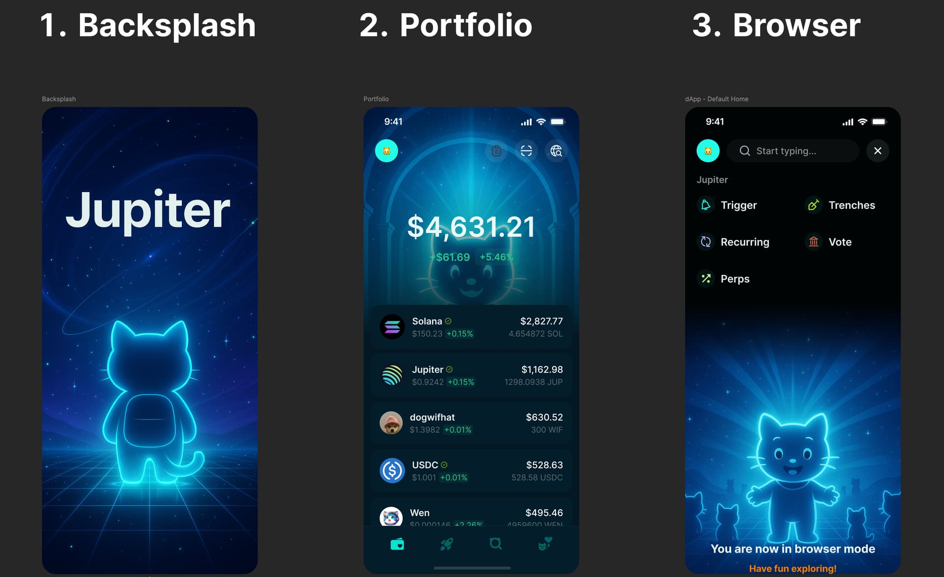
1. Splash Screen → Signal & Context
JTBD:
“Show me I’m entering something intelligent, elevated, and trustworthy — without overwhelming me.”
Semiotic Encoding:
- The glowing archway and starfield establish a spatial metaphor: Jupiter isn’t a dashboard. It’s a system you step into.
- The cat silhouette, center-aligned and backlit, borrows from classical hero and explorer tropes.
- The Jupiter logomark is positioned like a planetary body — functioning as a celestial brand asset users associate with orbit, gravity, and centrality.
Design Rationale: We signal “this is different” — not with animation or clutter, but with quiet scale. The lack of noise is intentional. The user sees themselves entering an ecosystem — not opening a wallet app.
2. Portfolio Screen → Reinforce Control & Significance
JTBD:
“Show me what I have — and make it feel secure, personal, and valuable.”
Semiotic Encoding:
- The cat’s face aligns with the portfolio balance — directly connecting identity with ownership.
- A radial light burst behind the figure creates a visual halo effect, subtly assigning importance and sacredness to the balance.
- The dome architecture and symmetrical framing mirror classic banking, religious, and ceremonial structures — signaling ritual + trust.
Design Rationale: The vault-like structure cues “protection” and “gravitas.” The user’s portfolio doesn’t feel like numbers — it feels like something revered. This shifts perceived value upward, while still being UI-efficient.
3. Browser Screen → Unlock & Belong
JTBD:
“Let me explore what’s possible — and make me feel like I’m part of something bigger.”
Semiotic Encoding:
- The central cat figure, now smiling and open-armed, becomes an ambassador — a visual stand-in for Jupiter’s identity.
- Surrounding cat silhouettes reinforce community presence — but kept abstract enough to maintain elegance and scale.
- The starburst background taps into visual grammar of revelation, opportunity, and growth.
Design Rationale: This screen doesn’t just list features. It frames exploration as activation. It invites. It suggests alignment. It uses symbols users already associate with openness and shared potential.
 Closing Strategic Thought
This direction didn’t start with “what looks cool.”
It started with “what each screen needs to do — and what each image needs to mean.”
By applying:
- Jobs-to-Be-Done → for precision
- Semiotics → for subconscious resonance
…I’ve built a system where every screen solves a function and speaks a language deeper than UI.
Not just usable.
Intuitively credible. Instinctively right.
1 Like
This looks super cool. You cooked. Hope your design goes places.
1 Like